Kill Your Darlings
A Case Study in Creative Decision Making
Role: Art Director
Great art direction is as much about what you take out of the frame as what you put into it. In our exploration for TxDOT, we chased meta humor and vintage editorial tropes before realizing that for a teen audience, simpler is always stronger.
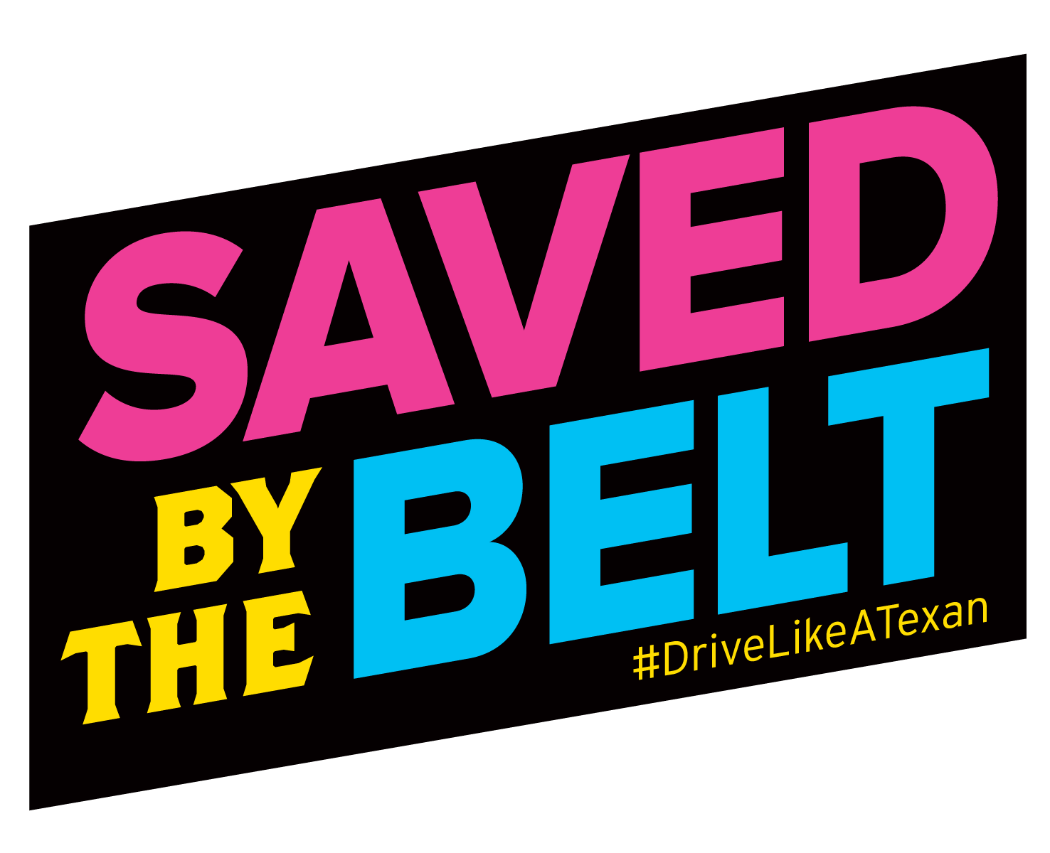
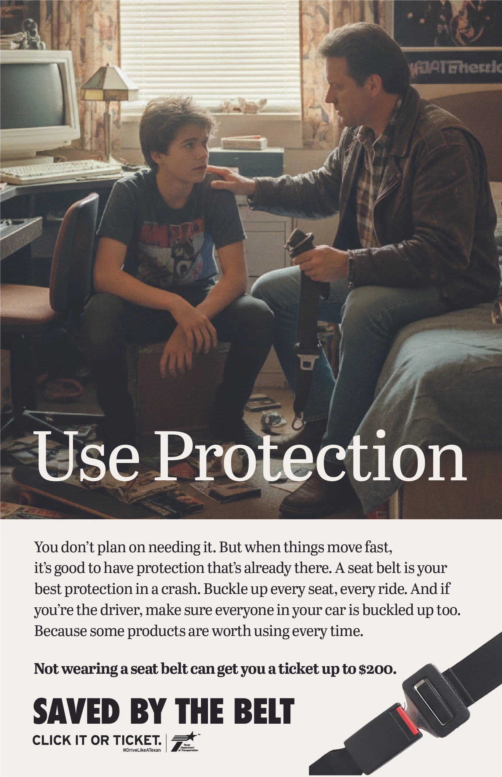
This campaign began with only a single headline: "Saved by the Belt." Presented to the client paired with a tongue-in-cheek image of a teenager in the driver’s seat rolling his eyes at his dad. The client loved it, so off we went to build a campaign around it.
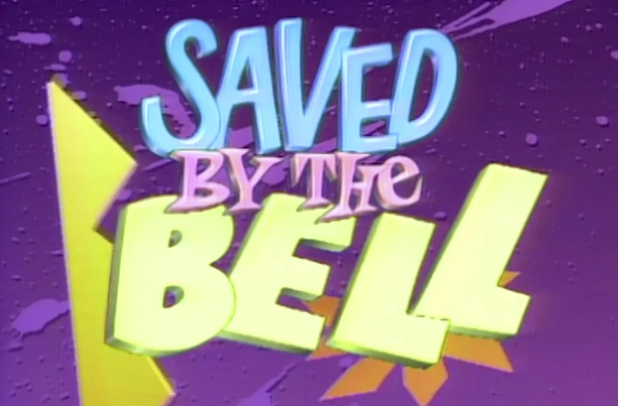
But as we moved into development, we identified an obvious creative hurdle: Whose nostalgia are we playing with? While the "Saved by the Bell" reference resonated with the decision-makers in the room, we had to ask if a Gen Z audience would even recognize the wink, or if the reference would simply land as another cringe government PSA.
As I saw it, there were two distinct directions this could go in, each requiring a distinct visual language:
The Sitcom Path
A literal, high-texture recreation of the 90s Bayside aesthetic. We worried this leaned too heavily on a lost nostalgia—playing to a generation that wasn't the target audience.
The Editorial Path
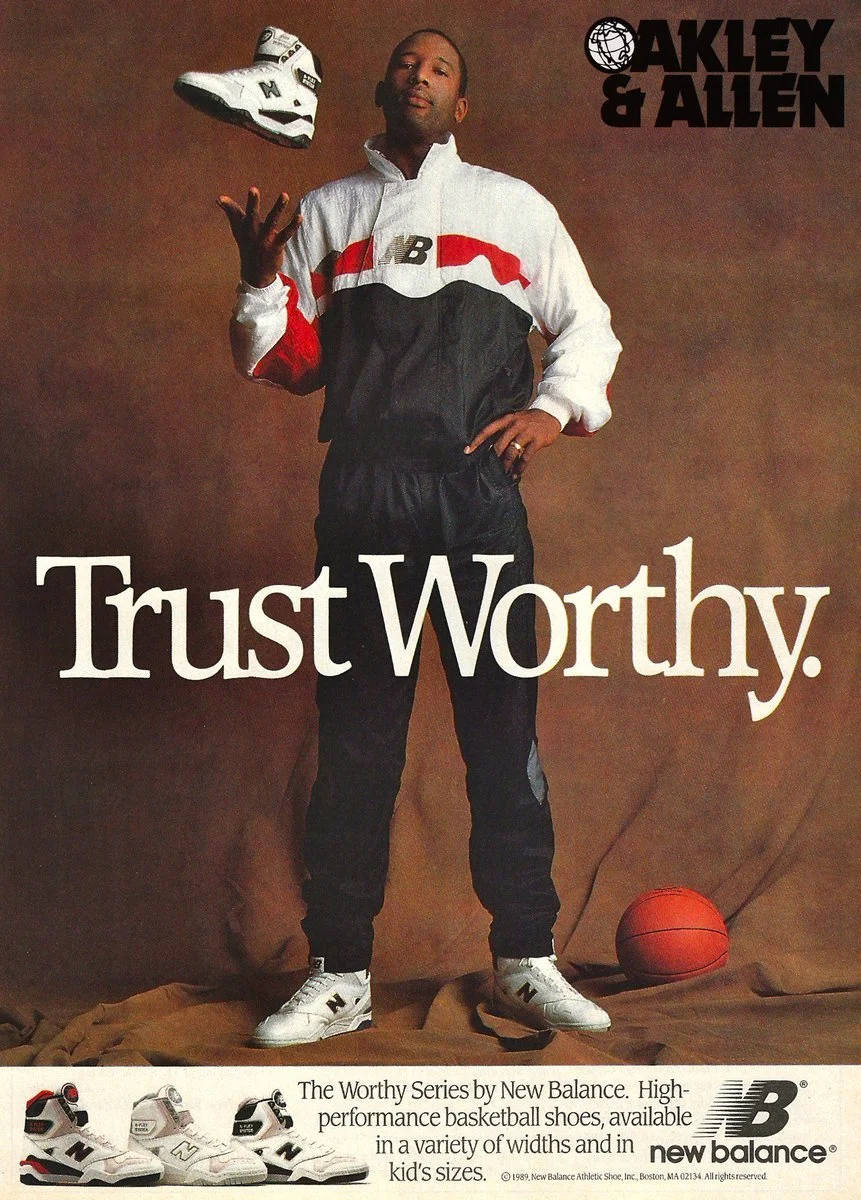
A meta-parody of 80s and 90s magazine PSAs. We saw a growing trend of younger audiences vibing with retro editorial styles—finding something ironically hip in the grainy textures and stiff layouts of vintage print ads.
Internally, we pushed for the second approach. It allowed us to move beyond a single TV show reference and instead play with the entire genre of cheesy safety ads. It was a way to acknowledge the corniness of the message while still delivering the mandate in a way that felt visually in on the joke.
I designed a series of layouts that mirrored the stiff, grainy, and melodramatic editorial style of vintage magazine advertisements from the 80s and 90s. This direction was built on double-entendres and awkward parental milestones. We aimed to evoke an ironically hip vibe that would build a "we’re in on the joke" rapport with teens. We hoped that by parodying the very medium of the PSA, we could disarm their skepticism and engage them through humor rather than a lecture.
While these directions were an internal favorite, they ultimately failed to move forward during our review process. We had to be honest about the mechanical efficiency of the work: the storytelling was becoming convoluted. The joke required the viewer to navigate too many layers—first recognizing the parody of an old magazine ad, and then realizing it was actually a seatbelt message.
Ultimately we realized we were designing for ourselves. It made us laugh, but there was a significant risk that a teenager would just see a grainy photo of a dad and a son and keep scrolling without ever reaching the hook. In the split-second world of digital banners and posters, these layouts were burying the lead. The seatbelt—the actual hero of the safety message—had become a secondary prop in a complex narrative.
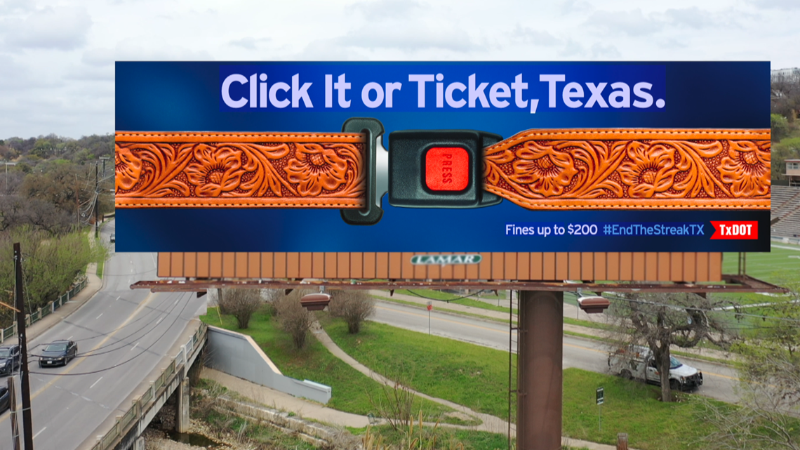
So we scaled back, and returned to a more literal interpretation of the sitcom aesthetic. I attempted to merge the iconic "Click It or Ticket" belt imagery—seen in TxDOT’s high-impact "Cowboy Belt" billboards—with the loud, vibrant textures of the early 90s. We traded traditional black webbing for custom seatbelts featuring geometric patterns and neon purples.
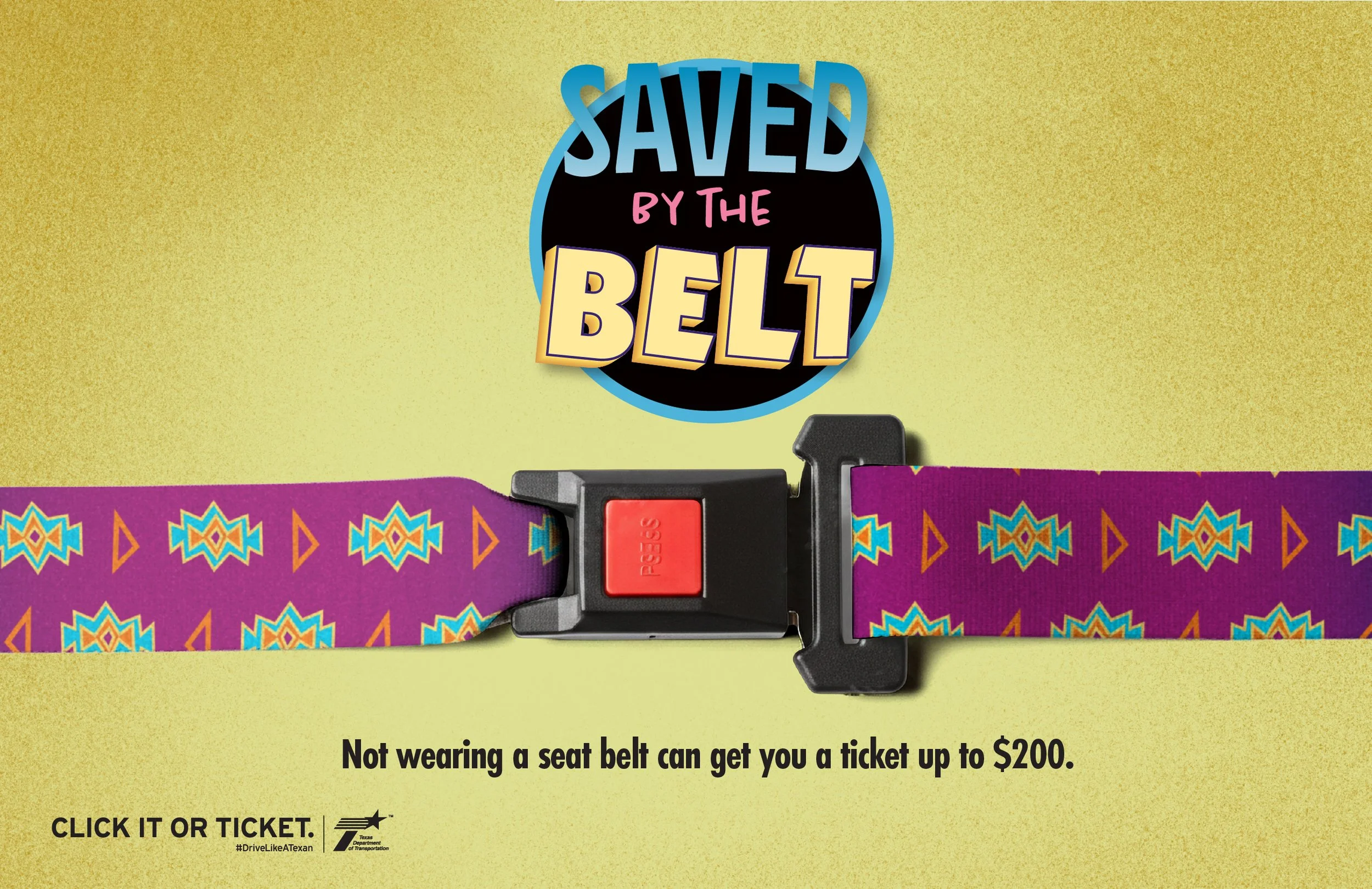
This, too, fell short. Without context, a patterned seatbelt was just a colorful strap. It lacked the immediacy required to stand on its own. We realized that for the parody to work, we had to get right to the point.
The breakthrough came when we stopped looking at the 1989 original and started looking at the 2020s reboot. We realized that while the 90s patterns felt dated, the modern revival of the brand had a visual energy that was perfectly tuned for today’s teens.
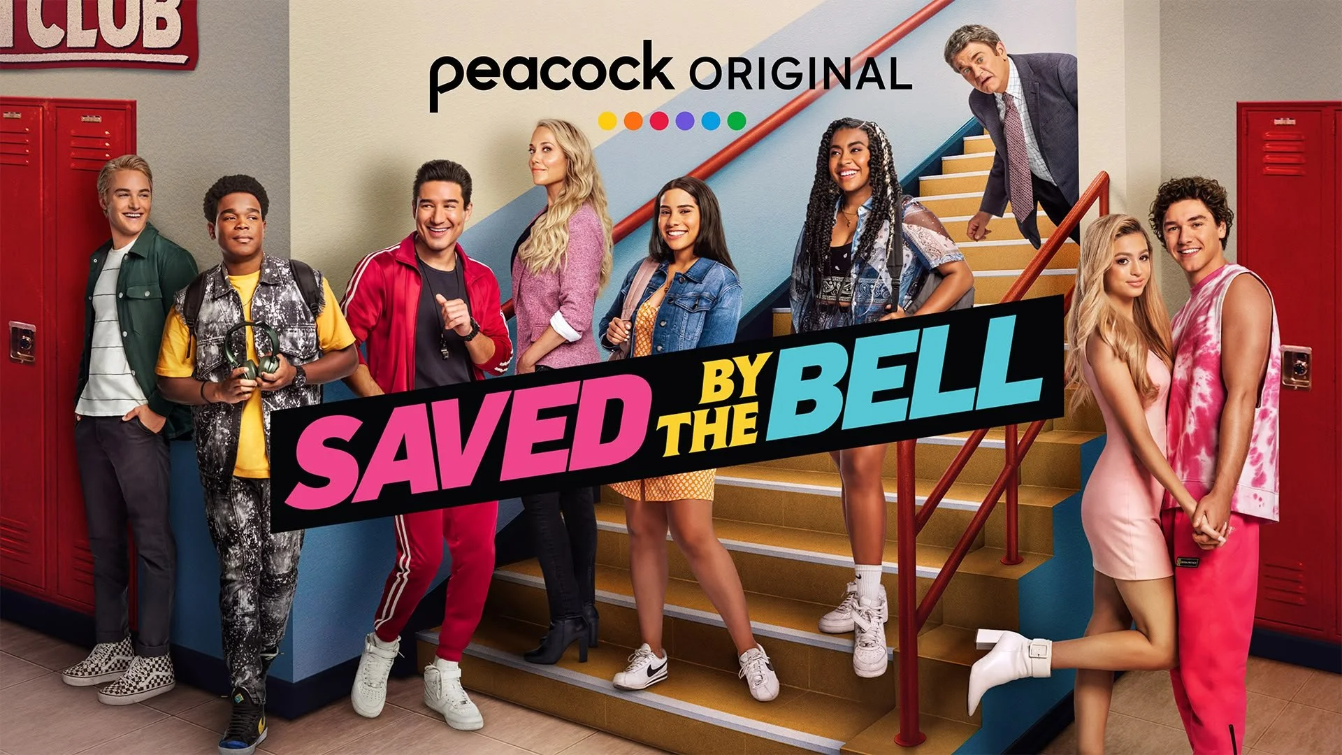
NBC/Peacock
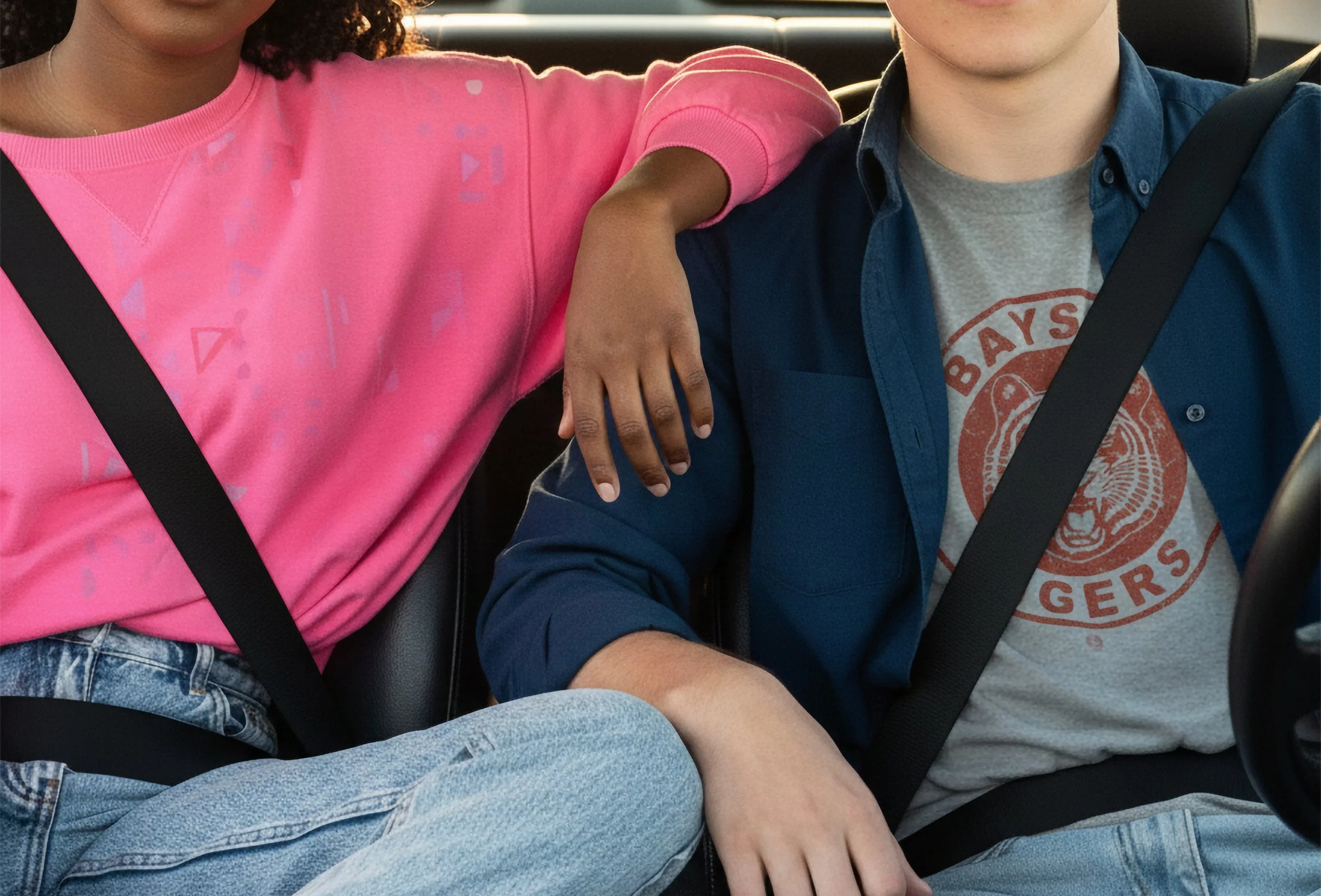
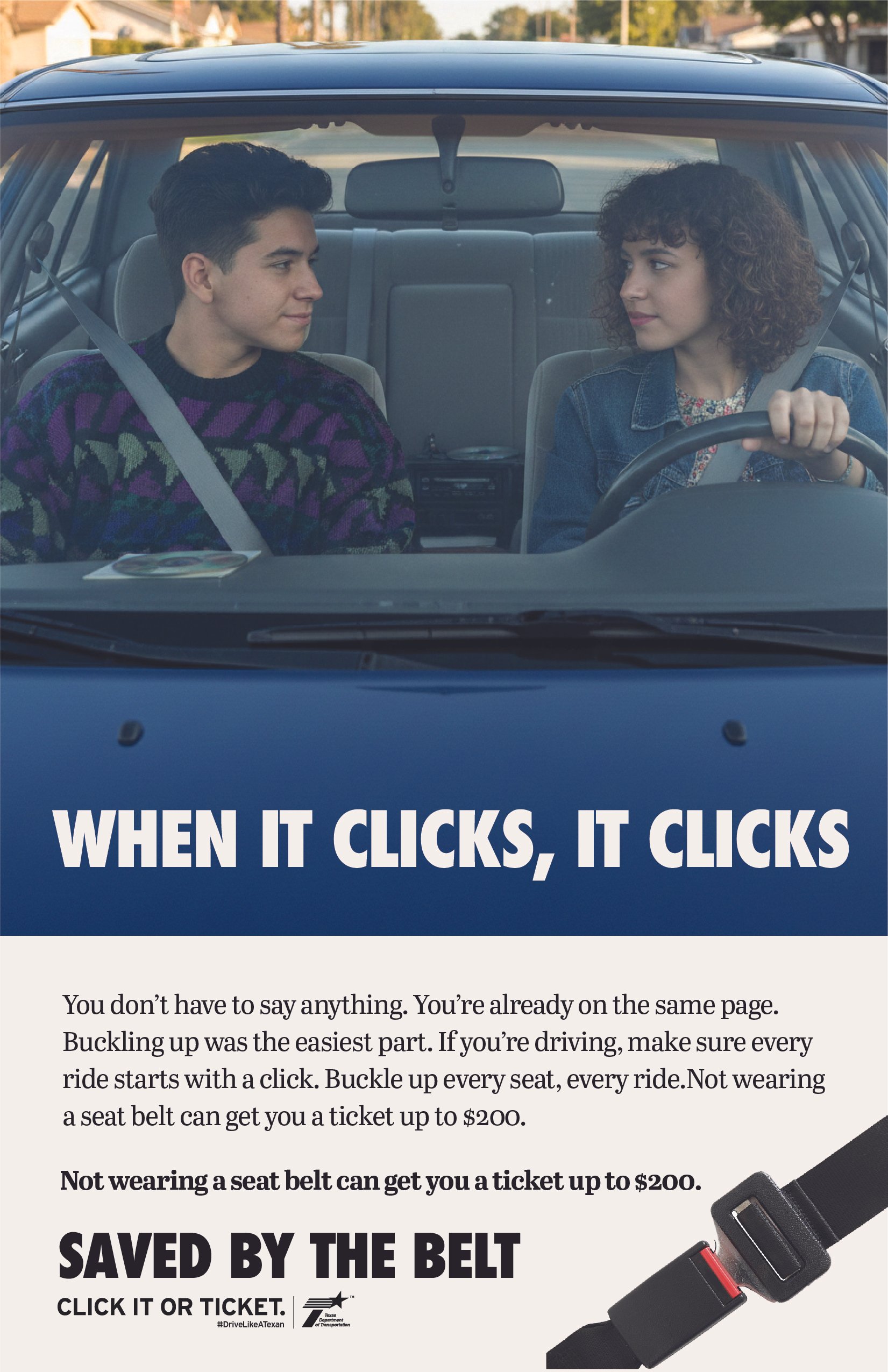
The final poster put the human, and the seatbelt, front and center. The Bayside Tigers shirt provided a winking nod to the classic show while maintaining a clean, recognizable look for a teen audience that didn't require a complex backstory to understand.
This project served as a reminder that the most effective art direction is often a process of subtraction. By resisting the urge to be clever for its own sake, we moved past the complex, multi-layered irony of our initial explorations to find a singular, undeniable visual truth. We traded a wide-angle narrative for a tight, iconic crop, proving that a clear message delivered with a subtle wink is infinitely more powerful than a loud one buried in a joke.
Creative Director: Tom Grodek
Copywriter: Garrett Forbes